

The First Announcement of Mobile-first
It feels like we’ve been talking about mobile-first for a long time, because, in reality, we have. At Pubcon on the 13th of October back in 2016, some news broke that would change the future of search yet again. In his keynote address, Google webmaster trends analyst, Gary Illyes, announced that mobile-first indexing would be coming in the not-too-distant future.
Google’s index will now focus on mobile pages, and desktop pages will be phased out where there is a mobile alternative.
There was a lot of speculation at the time of the announcement around exactly what this would mean for search. However, now that the SEO community has had some time to process the news, and with more concrete information from Google, we have a much clearer picture of what’s happening and why.
We’ve seen great presentations & posts on mobile-first indexing, it’s awesome to see all the details (thanks, @aleyda @jenstar @alexisksanders @dawnieando @badams + others)! There are only a few things we’ve sometimes seen confusion about, so we thought we’d clarify them.
— Google Webmasters (@googlewmc) June 14, 2018
If you still feel unsure about any elements of this change or exactly what will happen to your website, then Lumar is on-hand to clear things up for you. Read on to find out all the information you need, and feel empowered enough to take on the mobile-first index!
Here are some of the key developments since the first announcement:
There won’t be a separate mobile index
There won’t be a separate desktop and mobile index which will be maintained side by side. Google will only have one index which will be a combination of mobile-indexed content and desktop-indexed content, with the former starting to phase out the latter.
Think of it like a library that can have one copy of every book. Initially, it was all print books. As ebooks became popular, it starts to replace the print versions with ebooks. Still one library, mix of both types but over time, it’ll be mostly ebooks.
— Danny Sullivan (@dannysullivan) March 15, 2018
Google is sending out notifications when switching sites to mobile-first
We were originally told that the only way we could check for the indexing switch was to monitor Googlebot Smartphone activity in your log files and checking whether Google is caching your desktop or mobile content for a page. However, it was later announced that we’d receive notifications in Google Search Console when our sites are being switched.
Mobile content will be indexed for the mobile and desktop versions of a page
Mobile-first indexing means that whatever content appears on the mobile version of a page will be indexed for the desktop version too. This is why content parity is crucial, as whatever content is missing on your mobile-configured pages won’t be indexed.
Access the Downloadable PDF Version of This Guide
Why is Google Moving Towards a Mobile-first Index?
In their Webmaster Central blog, Google stated the following reason for the switch to mobile-first:
Today, most people are searching on Google using a mobile device. However, our ranking systems still typically look at the desktop version of a page’s content to evaluate its relevance to the user. This can cause issues when the mobile page has less content than the desktop page because our algorithms are not evaluating the actual page that is seen by a mobile searcher.
–Google Webmaster Central Blog
At the end of 2016, many articles were published detailing the news that mobile internet usage had overtaken desktop internet usage. This trend has been continuing to the point that nearly 60% of all searches are now on mobile.
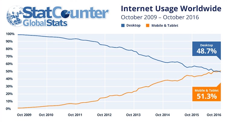
Source: StatCounter
Smartphones are our lives, and Google is our world.

It makes sense then for search engines to focus on this device, as mobile usage and the smartphone market both continue to evolve and grow. Google recognizes the dominance of mobile and wants to bridge the gap that exists between mobile users and the previous desktop-first indexing system. The mobile-first index aims to do away with disjointed user journeys on mobile.
The majority of users are now using mobile devices, therefore, Google is tailoring its services to its users by prioritizing mobile pages. Basically, Google is launching mobile-first indexing for a mobile-first world.
What is Mobile-first Indexing?
Now you know why this change happened, here’s what you need to know about how the mobile-first index will work and how it will handle your website.
Although our search index will continue to be a single index of websites and apps, our algorithms will eventually primarily use the mobile version of a site’s content to rank pages from that site, to understand structured data, and to show snippets from those pages in our results.
–Google Webmaster Central Blog
Google’s Danny Sullivan explained the update to the index in the following way:
Think of it like a library that can have one copy of every book. Initially, it was all print books. As ebooks became popular, it starts to replace the print versions with ebooks. Still one library, mix of both types but over time, it’ll be mostly ebooks.
How Crawling & Indexing Will Change
Although the new indexing system will certainly change things, the key elements of the SERPs won’t be affected. This is because Google will ideally be able to find the same information as before, but it will find this information from the mobile versions of pages instead.
Elements of search results, like the knowledge panel, won’t change with mobile-first indexing.
-John Mueller, Google Webmaster Hangout
The appearance of SERPs will remain unaltered, but one of the main changes we will see is the way Google crawls and accesses websites in order to find their content.
What seems like an incredibly long time ago (before the news of mobile-first), a website’s desktop page was the primary version and would be crawled and indexed as a priority. Any attention given to mobile versions of pages was minimal, and was more about checking configurations.
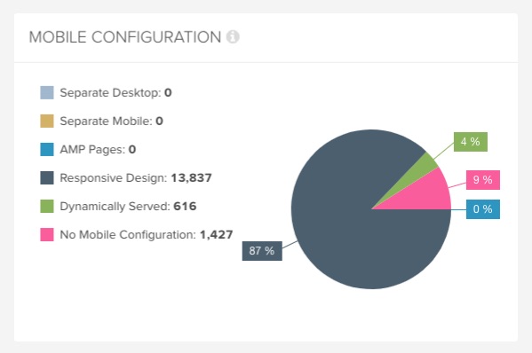
These are the three main website configurations, and how each one is crawled differently by Google:
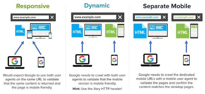
Responsive & Desktop-only Sites
Responsive design serves all devices with the same code that adjusts for screen size.
Desktop sites also sit within the same category as responsive as you can have a mobile-friendly desktop site that isn’t responsive.
Before mobile-first indexing: Google used to crawl responsive pages with a mobile user agent less frequently than with a desktop user agent. This was to confirm that the pages were mobile-friendly and that the mobile content was consistent.
After mobile-first indexing: Google will crawl responsive pages more frequently with a mobile user agent than with a desktop user agent.
Having a responsive site is the optimal design for mobile-first indexing, and is recommended by Google.
Sites that make use of responsive web design and correctly implement dynamic serving (that include all of the desktop content and markup) generally don’t have to do anything.
–Google Webmaster Central Blog
Despite still needing to carry out vital checks for mobile-first, owners of responsive sites have to make the fewest changes compared to the other website configurations.
Responsive sites don’t need to change for mobile-first indexing.
-John Mueller, Google Webmaster Hangout
For desktop-only sites, Google will still index and display them even if there isn’t a mobile option. So desktop sites won’t be dropping out of the index and completely disappearing.
If you only have a desktop site, we’ll continue to index your desktop site just fine, even if we’re using a mobile user agent to view your site.
–Google Webmaster Central Blog
However, if you have a desktop-only site that isn’t mobile-friendly, here’s what Gary Illyes asks:
What’s wrong with you?
–Gary Illyes, BrightonSEO Keynote
Harsh words. Those are Gary’s, not ours…
Dynamic Sites
Dynamic serving serves different code to each device, but on the same URL.
Before mobile-first indexing: Google crawled dynamic pages less frequently with a mobile user agent than with a desktop user agent. This was to check whether or not the pages were mobile-friendly and the mobile content was consistent.
After mobile-first indexing: Dynamic sites will be crawled more often by the mobile user agent than the desktop user agent.
Separate Mobile Sites
Separate mobile URLs serve different code to desktop and mobile devices, and on different URLs.
Before mobile-first indexing: Google would crawl the separate mobile pages with a mobile user agent in order to confirm that the URL was mobile-friendly and that the content was consistent with the desktop page, as well as checking that the rel-alternate and canonical tags were set up correctly. URLs would also be crawled with a desktop user agent in order to detect redirects between the desktop and mobile pages.
After mobile-first indexing: Despite mobile pages now being prioritized, desktop pages will still be shown in desktop search.
Most of the recommendations around having separate mobile sites are to migrate them to a responsive site. However, this isn’t essential if you make sure your mobile site is configured correctly, including having the proper Viewport settings which allow users to zoom content, for example.
The logic behind the recommendations for moving to responsive is to make things as easy as possible for users and search engines, as you would only have one URL to deal with rather than keeping track of two separate websites.
How is Mobile-first Being Rolled Out?
The messages we’ve received around the mobile-first rollout have been consistent.
Google has taken a cautious approach to mobile-first indexing and has been switching over groups of sites based on how ready they are, rather than ‘flicking the switch’ which can cause chaos for websites. However, the new system has already started rolling out.
We continue to be cautious with rolling out mobile-first indexing. We believe taking this slowly will help webmasters get their sites ready for mobile users.
–Google Webmaster Central Blog
Google is committed to switching over to mobile-first indexing on a step-by-step basis.
-John Mueller, Google Webmaster Hangout
Google will look at sites individually and switch over the sites which are ready for mobile-first before sites which are not.
-John Mueller, Google Webmaster Hangout
These are reassuring things to hear. Knowing that Google is proceeding with caution will cause website owners to breathe a sigh of relief, but now is the time to take action and make sure you’re ready. We don’t want to test Google’s patience indefinitely…
I recommend site owners take a hard look at their mobile setup now, before they get switched over to mobile-first indexing. By identifying potential problems in the short-term, you can resolve them before they cause even bigger problems down the line. Don’t just think your setup is OK. Make sure it’s OK. Good luck.

Although you should be prepared and be making the required changes in time for the indexing change as soon as possible, an important thing to bear in mind is that in some instances rushing can actually cause more damage than good. Google advises us to consider that “a functional desktop-oriented site can be better than a broken or incomplete mobile version of the site”, so don’t rush into launching a new mobile site until it’s ready and has all of the correct implementations and functionality!
How Can You Tell You Are Being Indexed Mobile-first?
Despite what we’ve previously been told, Google has now announced that they will actually send notifications about the switch to mobile-first to webmasters via Google Search Console.
If you’re itching to know if your site has been switched to mobile-first indexing and you simply can’t wait until you get a message in your Google Search Console account, the good news is that you’ll also be able to do some proactive digging yourself. Here are the ways you are able to check for yourself.
There are two other ways you can see if you’re being indexed mobile-first:
- Look for an increase in crawling by Googlebot Smartphone
- Look for content from the mobile site appearing in Google’s cached pages
Monitoring Google’s Activity on Mobile vs Desktop
If you’re wanting to find out whether or not your site has been switched across, an increase in crawling activity from Googlebot Smartphone is a huge clue. Traditionally, the desktop crawler would do around 80% of Google’s crawling, with the mobile crawler doing around 20%. However, these percentages will flip when your site is switched to being indexed mobile-first.
In order to see Googlebot activity, you’ll need to take a look at your log files.
Webmasters will spot the switch to mobile-first indexing in log files.
-John Mueller, Google Webmaster Hangout
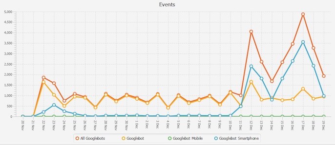
At Lumar, we provide log file data as an additional source within our crawls, which helps our users check Googlebot Smartphone activity on their sites. You are able to link your log files with your crawls and see the number of user agent hits split by desktop and mobile, which will give you a clear indication of Googlebot activity for each device.
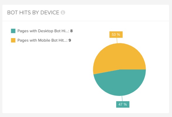
Source: Lumar
If you can see that 80-20 split in favor of Googlebot Smartphone hits that we mentioned, then you’re being indexed mobile-first.
Checking Google’s Cached Content for Your Pages
Another way to see where your site stands in terms of indexing is to go and see which version of your page Google is caching. Simply find your pages in the SERPs, go to the cached page and see for yourself what content is being displayed for your URLs.

If you see the mobile version of that page then, you guessed it, you’re being indexed mobile-first.
So there’s the answer; take a look at Googlebot Smartphone activity and how your pages are being accessed, as well as how Google is caching and displaying your pages, and you should have a very clear idea of where you stand.
Key Considerations for Mobile-first
Now we know more about mobile-first indexing, why it’s being implemented and how it will affect crawling, let’s look at the key elements we need to bear in mind for our websites.
Director of Organic Search at Peak Ace AG, Bastian Grimm, has put together this handy list of 10 tips for preparing your website, which we love!
- Understand your mobile setup and its pros & cons – What are you using and why? Is the configuration done properly?
- Are you targeting the right keywords on mobile? – Check search demand based on device split and adjust accordingly
- Are you sure your site really is mobile friendly? – East test: verify yourself using built-in Chrome DevTools (Ctrl+Shift+I)!
- Make sure to not prevent access by using interstitials! – Or any other type of overlay/pop-up that has negative effects on UX!
- Did you check all GSC reports properly? – Of course the mobile usability report – but what about rich cards, are these also mobile?
- Check GSC fetch & render for mobile as well – Pay close attention: identical content? Anything missing? Blocked resources?
- Do a full site health check and focus on mobile issues – Lumar has in-depth reporting on everything mobile
- Simulate Googlebot for smartphones with JS rendering – Pay close attention to rendered output, crawlers are useful for this
- Get all the content on your mobile site – Is your schema.org markup available on mobile; indexation rules, canonical tags, etc.?
- Don’t f***ing panic!

Now let’s dive into the mobile-first considerations in more detail. We’ve split them into five main categories, as well as a section at the end for important checks everyone should be making for their sites.
- Content
- Internal Linking
- Hreflang
- Structured Data & Video
- Page Speed
Content
One of the resounding points around mobile-first preparation is to ensure content is consistent across desktop and mobile.
This is to ensure that the content you actually want to rank for is included on your mobile site, as Gary Illyes explained.
If you have an amp. or a separate mobile site or a dynamic serving [site] then just make sure that the content that you want to rank for is actually there on the mobile site. Pay attention to metadata, noindex, hreflang, structured data, images and media.
If the content you want to rank for is missing on mobile, you will undoubtedly see negative impacts on your site’s performance following the indexing shift. This is one of Google’s main concerns for website owners.
Google is creating classifiers internally to make sure mobile pages are equivalent to desktop pages and that sites don’t see any negative effects from the switch.
-John Mueller, Google Webmaster Hangout
These are the elements to consider when checking for differing content across devices:
- Textual content
- Metadata
- Images
- Alt attributes
Google’s mobile-first team has noticed many sites don’t include alt text for images on mobile sites.
-John Mueller, Google Webmaster Hangout
Each of these four elements must also be crawlable and indexable.
If you’re wondering about the best way to check for content inconsistencies across devices, Lumar provides two convenient reports for checking mismatches between your mobile and desktop content.
The first one is the Mobile Content Mismatch report which highlights mobile pages with a different title tag or H1 tags for a more top-level view.
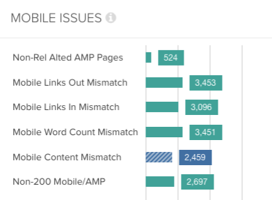
The second one is the Mobile Word Count Mismatch report which shows which desktop pages have a different word count to their mobile alternates, so you can quickly identify inconsistent body content.
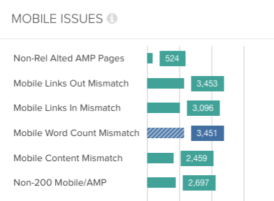
Both of these reports can show you where you are serving different content on your mobile site or setup, as well as where you are actually missing content.
Another aspect to consider is that hidden content on desktop pages (such as tabbed or accordion content) used to be given a lower weight for ranking. When the mobile pages become the primary source for indexing, Google has said this will no longer be the case and that tabbed content will carry the same weight.
Content behind tabs on mobile will be seen by Google when mobile-first indexing is released.
-John Mueller, Google Webmaster Hangout
Internal Linking
Mobile pages are going to be prioritised, and so is mobile linking. It’s been confirmed by Google that the link graph will use links from mobile.
Mobile-first indexing will use the links on your mobile pages for calculating the link graph.
-John Mueller, Google Webmaster Hangout
A potentially surprising thing to note about linking considerations for mobile-first is that while content may need to remain equivalent across desktop and mobile, this doesn’t apply for internal linking. The following information was revealed by Google Webmaster Trends Analyst, John Mueller, in a tweet
It doesn’t need to be the same but it should be crawlable.
— ???? John ???? (@JohnMu) January 2, 2018
Your internal linking structure doesn’t have to be the same across desktop and mobile, but it does have to be crawlable, so that Googlebot is able to find all of your mobile pages easily.
The key thing to bear in mind around internal linking on the mobile version of your site is accessibility for users and search engines, and whether you’re making it harder for them to get to particular pages due to reduced internal linking.
Be mindful of whether or not reduced internal linking on your mobile site has created any orphaned pages which aren’t actually linked anywhere internally, or a higher number of levels in your site depth; keeping your pages at arm’s length from users and search engines.
The best way to check the internal linking and site architecture of your mobile site is to run a crawl with a mobile user agent. This way you will be able to see exactly how accessible you are making your mobile pages through the use of linking.
You should also check the depth of the site architecture for your mobile site by crawling it separately to your desktop site. Then you will be able to compare the number of pages as well as the depth of pages between the two crawls.
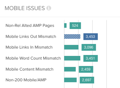
Lumar also provides two handy reports on your mobile linking, so you can see where there are differences from your desktop configuration.
The first one is the Mobile Links In Mismatch report, which shows mobile pages with fewer links coming in from other internal pages than their desktop counterpart.
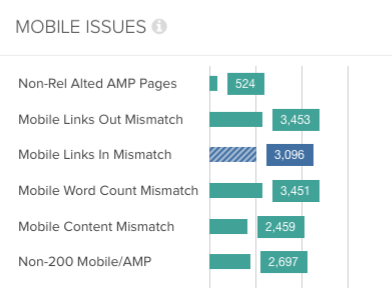
The second one is the Mobile Links Out Mismatch report, which flags mobile pages with fewer links out to other internal pages compared to the desktop equivalent.
Hreflang
For separate mobile sites, you will need to include hreflang links on mobile URLs. Mobile and desktop URLs must be linked separately when using link rel=hreflang. Mobile hreflang should also point to other mobile URLs, with desktop linking to desktop.
Yes, mobile-to-mobile & desktop-to-desktop is our recommendation for hreflang.
— ???? John ???? (@JohnMu) November 29, 2017
No additional configuration is required with regard to hreflang for responsive sites.
If you have a responsive site, you don’t need to do anything special. The URLs are the same on desktop & mobile. Easy 🙂
— ???? John ???? (@JohnMu) November 30, 2017
Structured Data & Video
Having properly marked up pages is more crucial than ever in these mobile-first times.
The biggest challenge for mobile-first will be understanding the lightweight needs of the user and applying this via condensed content. This is one of the main reasons why the search engines are increasingly raising the awareness of importance of structured data and markup. This allows for disambiguation when content is not so prevalent on a page in an unstructured form.

So you need to make sure your markup isn’t neglected during your preparations for the updated index. Structured data and video should be treated in a similar way to content, in that consistency is key.
Markup and onsite videos should be consistent across desktop and mobile for ranking purposes, and they also need to be crawlable and indexable.
Hidden markup like structured data, hreflang tags and links for AMP should also be equivalent for mobile-first.
-John Mueller, Google Webmaster Hangout
You don’t just need to focus on textual content; you need to move across everything that will help you rank to your mobile site or setup, if it isn’t there already. This includes structured data.
Another thing to note is that videos are actually more accessible for Google on mobile pages, so it makes sense to correctly serve videos over mobile as a priority anyway.
From mobile-first testing, Google have noticed it’s easier to get videos for indexing from mobile pages.
Page Speed
Google has confirmed the importance of page speed for the new indexing system, with what has been called the Speed Update. With this update, we have learned that page speed is going to become a ranking factor for mobile and that the slowest loading sites will be penalized. Speed won’t take precedence over the relevance of a result and how it matches the searcher’s intent, but it will play an overall part in mobile rankings.
One of the latest releases from Google will go hand in hand with the mobile-first index and page speed optimization. A tool has been launched for benchmarking your mobile speed against competitors as well as a calculator which tells you how much revenue you are losing based on your site’s speed. Try out the Mobile Speed Scorecard and Impact Calculator for yourself, and see how your site measures up!
The latest updates from Google enforce the point that mobile page speed is a huge focus for them, and it should be one our main priorities as digital marketers.
Another reason to prioritize mobile site speed is that in terms of speed scoring, Google will look at the mobile results as a priority now as well.
For page speed (scoring), the mobile version will be used instead of the desktop version.
Important Checks
We’ve covered the big topics of consideration for mobile-first, but what about the other details that can be forgotten? Bypassing even the smallest issue can cause huge repercussions in the SEO world, but as Bastian has assured us in his checklist, there’s no need to panic! Luckily we’ve thought of everything else that can possibly be a hindrance to your website during the indexing change. Take a look for yourself, and see if there’s anything you hadn’t previously planned for.
For Responsive Sites:
- Make sure no important resources are being blocked such as images, JS & CSS
- Check for legacy issues such as existing dynamic mobile pages or separate mobile pages that exist alongside your responsive site – these will be indexed instead of the responsive page!
For Dynamic Sites:
- Include all important desktop content and markup on the mobile version of the page
- Check that the vary: user agent HTTP header is in use
- Make sure the right user agent is being served the correct version of a page
With dynamic serving, Googlebot Smartphone might not see the full content after the move to mobile-first, which would mean less to look at for indexing.
-John Mueller, Google Webmaster Hangout
For Separate Mobile Sites:
- Include all important desktop content and markup on the mobile version of the page
- Maintain existing links between desktop and mobile pages and existing rel=canonical and rel=alternate setup (Google doesn’t want anyone to have to go and switch all of their canonical tags!)
- Guide the mobile and desktop user agents to the correct page version with 301 redirects
- Make sure your servers have the capacity to handle increased crawl rate from Googlebot Smartphone
For separate mobile sites it’s important to bear in mind all the above points, but Google has also admitted that they want to make the changes needed for mobile-first indexing as simple as possible.
Google is trying to minimise any changes required for mobile-first.
-John Mueller, Google Webmaster Hangout
So just as Google doesn’t want everyone to have to go and change their entire canonicalization structure, the search engine doesn’t want everyone to have to change their sitemaps either.
It won’t be necessary to include mobile pages in sitemaps for mobile-first indexing.
-John Mueller, Google Webmaster Hangout
No matter what type of configuration you’re using for your website, there are some things we all need to bear in mind for mobile-first. Here are some additional checks you need to make:
- Test your robots.txt file to make sure your mobile site is accessible to Googlebot Smartphone in the first place.
- Make sure the mobile version of your site is verified in Search Console as well as the desktop version.
- Check your mobile site for any display or UX issues. We recommend using Google’s mobile-friendly testing tool, as well as inspecting your mobile site yourself on your phone. Try setting yourself some key objectives and see if you can achieve them on mobile with ease and success, looking out for any missing content or elements along the way!
The Fetch & Render tool set to use a smartphone user agent, the Mobile Friendly Testing tool, and the AMP Testing tool can be used to show you the content Google will use for the mobile-first index.
-John Mueller, Google Webmaster Hangout
One of the best ways to test your site for mobile-first readiness is through mobile crawling, just ask Google.
Google recommends using SEO tools that support mobile crawling to test for mobile-first indexing.
-John Mueller, Google Webmaster Hangout
Lumar is a tool that supports mobile crawling and can run crawls using a mobile user agent, so we can see exactly what Googlebot Smartphone will see when it comes across your site. This way you can make sure your site isn’t throwing up any unexpected surprises on mobile for Google.
If you want to look at your desktop and mobile sites side by side, Glenn Gabe wrote an article all about “Lumar’s test site feature, which you can hack to compare against your mobile subdomain.” With a view of both your desktop and mobile sites you can make those key comparisons and see the differences between them.
As well as checking what the search engines can see, you should check what version of your site your users are seeing. A great way to see whether or not your website is correctly configured is by examining whether any of the mobile versions of your pages are being served to desktop users, and vice versa. When you run a crawl with Google Search Console data included you can see where you have received impressions from mobile devices on your desktop pages, so you’ll know that something has gone wrong meaning users are being served the wrong content for their devices.
All of these checks are crucial to ensure mobile-readiness for a website. However, Google has suggested that website owners will be provided with a safety net, in that we will be sent alerts for mobile-first issues.
Google will send alerts for mobile-first issues such as mobile pages having less content and markup than desktop pages.
-John Mueller, Google Webmaster Hangout
So we have some reassurance there, but it is in no way recommended to ignore mobile-first preparations until Google gives you a nudge. Once the search engine notices issues with your website, it could already be too late to save it.
A Glimpse into the Future of Mobile
As if a complete guide on mobile-first wasn’t enough for you, as an added bonus we’ll be taking a brief look into the future of mobile and thinking about some of the upcoming things that lie ahead in search.
The SEO community are looking ahead to voice search and PWAs as the future beyond mobile-first.
There are two trends that are part of the change toward a mobile-first index. First is that we’re expecting over the next 5 years for voice search to hit a tipping point and drive more than half of the mobile traffic. This means that companies are going to have to start thinking about optimizing their sites for voice-related queries which are more conversational in nature. It also means that companies will need to focus on helping consumers go from “Question and Answer” to “Question and Action”, which comes through Voice Skills and chatbots.
Another big trend coming as we move toward a mobile-first index is going to be the blurring lines between apps and websites — and how companies choose to develop their content in order to maintain their relationships with consumers. Brands might choose to invest in developing progressive web apps (PWAs) versus focusing on optimizing their existing site for page speed or coding for accelerated mobile pages.

If you’re an inquisitive type of digital marketer and would like to learn more about the future of search, here are some helpful resources for you to do some extra reading around voice search and PWAs.
In Conclusion
Preparations for mobile-first indexing and thorough testing are crucial. Make sure you stay ahead of the curve and don’t get caught out by any of the changes that will be coming, because your website will be the one to suffer.
The focus for SEOs and digital marketers should now be on mobile, if it wasn’t already. That’s where searchers are and that’s where search engines are going, so don’t get left behind. Desktop-first has become a thing of the past, so all website considerations and online marketing should be approached with a mobile-first mindset.
There’s a lot to test on your site to make sure it’s ready for mobile-first indexing, but you don’t need to go it alone. Remember that Lumar is here to help you monitor your site for those key mobile-first considerations. We are on hand to answer any questions you have, so please get in touch.
Simply log in or sign up for an account to try some of our mobile reports and see first-hand just how useful this crawler can be for your website’s mobile-first needs.
Best of luck to you all!
Access the Downloadable PDF Version of This Guide